07/06/2026 06:44am

Figma to React: The New Frontend Dev Workflow in 2026
#Figma to React
#Frontend workflow 2026
#Design handoff
#Figma Dev Mode
#Design Token
# Frontend Developer
# Design System
#React component
If you've ever sat in Figma inspecting a hex color only to find it doesn't match what the Designer told you — or spent two hours in a handoff meeting arguing whether a padding value is 16px or 20px — you're not alone.
These problems don't happen because the team isn't good enough. They happen because of the gap between Design and Code that has always been there. Designers live in one world, Developers in another, and every time work gets handed off, both sides have to translate for each other all over again.
But in 2026, that gap is genuinely getting narrower. And this time.
How Figma Dev Mode and the 2026 Workflow Have Changed
Four or five years ago, Figma was just a design tool that Developers opened occasionally. Today it has become a real part of the Development Pipeline.
Figma Dev Mode is a mode built specifically for Developers. You can click on any component and immediately see CSS properties ready to copy — spacing, typography, border-radius, and colors already mapped to Design Tokens. No guesswork, no asking.
But more important than the inspect panel is the ecosystem that has grown around it. In 2026, the workflow we're talking about is built on three core pieces: Design Tokens that actually sync, Components designed with Code in mind from the start, and tools that generate code good enough to be genuinely useful.
Step-by-Step Workflow: From a Figma Frame to a Real React Component
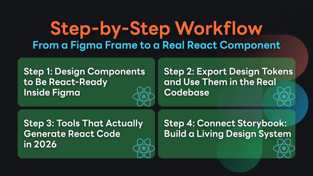
Step 1: Design Components to Be React-Ready Inside Figma
The most common problem teams run into is that Designers create beautiful Components, but when Developers go to translate them into code, it ends up being nearly a full rebuild — because the structure in Figma never accounted for props or state.
The technique that makes collaboration significantly easier is matching Component Naming to Code.
Instead of naming a Layer Button / Large / Blue, change it to a Button Component with Variant Properties named size (values: sm, md, lg) and variant (values: primary, secondary, ghost) — which maps directly to the Props a Developer will create in React.
Auto-layout is Flexbox in disguise
When Designers use Auto-layout correctly from the start — setting Direction, Gap, Padding, and Alignment properly — it translates 1:1 to CSS Flexbox. No guessing, no asking. Just open Dev Mode and the Flexbox values are right there.
Constraints and responsive behavior
Ask Designers to set Element Constraints to reflect real screen behavior. If a Button should fill its container's width, set the Horizontal constraint to "Fill" rather than a Fixed Width — because that means the Developer writes width: 100%, not width: 320px.
Step 2: Export Design Tokens and Use Them in the Real Codebase
A Design Token is a named value — for example, color.primary.500 = #3B82F6 or spacing.md = 16px — instead of embedding hex codes or raw numbers directly into Components.
In 2026, two main plugins handle this well: Token Studio (Tokens Studio for Figma) and Figma Variables, which now support exporting in multiple formats.
The process most teams use today looks like this:
Designers define Variables in Figma — Color, Typography, Spacing — completely
Export them as JSON via Token Studio or the Figma Variables API
Use a tool like Style Dictionary to transform that JSON into CSS Custom Properties, a Tailwind config, or a JS object — whatever the codebase needs
Every time a Designer updates a Token in Figma, the Developer just runs a sync script and every value in the project updates automatically
It sounds great, but there's one thing to watch out for: Tokens with poor naming from the start will cause problems down the road. Names like blue-1, blue-2, blue-3 carry no meaning. Use Semantic Naming instead — color.background.primary, color.text.muted, color.border.danger — so any Developer instantly understands when to use each one.
Step 3: Tools That Actually Generate React Code in 2026
This is the section people ask about most, and the honest answer is: no tool generates production-ready code 100% of the time. Every tool still needs a Developer to review and adjust. But the quality of the generated code has improved enough to genuinely reduce effort.
Figma AI Codegen (Built-in)
The feature Figma has built into Dev Mode can now generate React or HTML/CSS directly from a selected Component. The output is reasonably clean when the Component is designed with Auto-layout and proper Variables. The weakness is that it still can't handle state or logic — you get UI structure only.
Builder.io
Excellent for teams that want a continuous workflow. It has a Plugin that syncs Components from Figma and generates React, Vue, or Angular. Code quality is better than most alternatives in the sense that it uses proper component structure — not just nested divs.
Locofy
Locofy's strength is speed. It can convert a Figma design into React code very quickly — great for prototypes or MVPs. But the output tends to have a lot of inline styles and the structure isn't as clean as Builder.io. If you're using it for production, expect to refactor quite a bit.
Anima
Anima focuses especially on responsive design. If a Designer has set up breakpoints in Figma, Anima will attempt to generate responsive code to match. Best suited for projects with complex responsive behavior.
How to choose the right tool for your team
If you're just starting out, try Figma's built-in codegen first — it's free and lives inside the tool you're already using. If you need better code quality and are willing to pay, Builder.io delivers more value. If speed is everything and you'll refactor later, Locofy gets the job done.
Step 4: Connect Storybook: Build a Living Design System
Storybook is what makes a Design System truly alive — rather than just a Figma file that only Designers look at.
The workflow available in 2026 uses the Storybook Connect Plugin, which embeds Storybook stories directly inside Figma. Designers can see the actual working React component sitting right next to their design. If the component in Storybook and the design in Figma diverge, they'll notice immediately — without waiting until it hits production.
Beyond that, Chromatic — a platform built specifically for Storybook — enables automatic visual regression testing. Every time code is pushed, Chromatic screenshots every story and compares it against the baseline. If anything changes unintentionally, it flags it right away. It catches UI bugs faster than any manual QA process.
Common Mistakes Developers Make and How to Handle Them
These are things nobody talks about much, but they happen in real teams all the time.
Generating code and getting div soup with ten levels of nesting
This happens often when a Figma Component has Layers that don't use Auto-layout and has Groups stacked several levels deep. The fix: before generating code, ask Designers to flatten unnecessary layers and make sure every container uses Auto-layout.
Tokens in Figma and in the Codebase falling out of sync
Usually happens when someone updates a token in Figma without telling the Developer, or changes a value in the Codebase without updating Figma. The solution is to establish a clear process: Figma is always the single source of truth for Tokens. No value gets hard-coded in the Codebase if it doesn't exist as a Token first.
Designers and Developers having different ideas about responsive behavior
Developers tend to think in breakpoints. Designers tend to think pixel-perfect at every screen size. This needs to be aligned from day one — agree on which breakpoints the project supports, and whether design files will cover mobile and desktop only, or tablet as well.
Don't mistake generated code for a finished product
This is where many teams go wrong. These tools significantly reduce time-to-first-draft, but the generated code still needs to be reviewed by a Developer who understands accessibility, performance, and maintainability. Never ship generated code straight to production without a proper review.
The Right Workflow Is the One Your Team Will Actually Use
None of the techniques and tools covered here need to be implemented all at once. Teams that succeed with a Figma-to-React workflow almost always start small — agreeing on Component naming conventions first, then gradually adding Design Tokens, then Storybook, and finally integrating code generation tools.
The most important thing is getting Designers and Developers speaking the same language. Tools just make that language more precise. But if both sides aren't aligned to begin with, no tool will fix it.
If you're starting from scratch or want to build a Design System that actually scales, Superdev Academy has Frontend courses covering everything from Component Architecture to working effectively with Designers — the way it actually works in the real world.
Follow Superdev Academy on all platforms:
🔵 Facebook: Superdev Academy Thailand
🎬 YouTube: Superdev Academy Channel
📸 Instagram: @superdevacademy
🎬 TikTok: @superdevacademy
🌐 Website: superdevacademy.com
Written by the Superdev Academy team | Last updated: May 2026