07/06/2026 06:44am
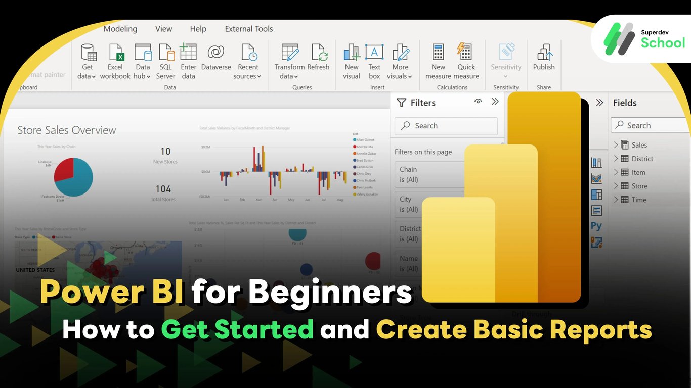
Power BI for Beginners: How to Get Started and Create Basic Reports
#Power BI
#Getting started with Power BI
#Creating reports in Power BI
#Power BI for beginners
#Creating Power BI dashboards
Have you ever encountered the problem where large amounts of data are stored in a disorganized way, making it harder to analyze? Or perhaps, there are times when you need to create a report for your team but don’t know where to start? If you've faced these challenges, you're not alone. Managing and analyzing data can be daunting for many, but fortunately, there is a tool that makes this process much easier: Power BI. This tool helps you turn data into easy-to-understand visuals and enables efficient decision-making.
In this article, we’ll introduce you to Power BI, from the basics to how to get started, with examples that will help you understand how this tool can assist you in your work.
What is Power BI?
Power BI (Power Business Intelligence) is a tool from Microsoft that allows you to easily manage and analyze data from multiple sources. Instead of relying on Excel or complex tools, Power BI enables you to present data in the form of charts and graphs that are easy to understand and interpret. These tools help facilitate faster and more effective business decision-making.
Example:
Suppose your business has sales data from various sources, such as website data, sales records from distributors, and information from accounting software. Power BI can combine all of this data and create a dashboard that displays all the information in one place, allowing you to view key sales data in real-time.
The Benefits of Power BI
1. Easy Access to Data from Various Sources
Power BI can connect to multiple data sources, including Excel, SQL Server, or even online systems like Google Analytics or Salesforce. This means you don't have to waste time pulling data from different places. With Power BI, you can simply connect and view all your data in one place.
2. User-Friendly Tools
Even if you have never used data analysis tools before, Power BI is designed to be easy to use. Its intuitive interface allows you to create graphs or reports with just a few clicks, making it accessible for anyone.
3. Quick Report Sharing
You can easily share the reports or dashboards you create in Power BI through Power BI Service, meaning everyone on your team can access the data anytime, anywhere.
Example:
When you create a monthly sales summary report from data in Excel, you can use Power BI to share the information instantly with your sales team. No need to send Excel files or documents anymore—everyone can view the real-time data via the dashboard you created.
Power BI Capabilities
Power BI is a powerful data analysis tool that allows users to connect and process data from various sources, and then create visually appealing and easy-to-understand reports and dashboards. Let’s explore the core capabilities that Power BI offers:
1. Dashboard Creation
One of Power BI’s standout features is the ability to create dashboards that display data from multiple sources in one place. Users can build dashboards that combine various graphs, tables, and charts, all linked to data from different sources such as SQL databases, Excel files, or other cloud services like Google Analytics or Salesforce.
Example:
If you want to create a dashboard to track sales and profit from multiple data sources (e.g., CRM data, sales database data, and online marketing data), Power BI allows you to create a dashboard that brings all the data from different sources into one cohesive view. This not only makes it convenient to view the data but also helps you make quicker and more informed decisions.
Updating the data in the dashboard ensures that everyone on the team sees the most up-to-date information at the same time, reducing errors that may arise from using outdated data.
2. Using Graphs and Charts
Power BI offers a wide variety of customizable graphs and charts, allowing users to present data in diverse and easily understandable ways. In addition to the commonly used bar charts and line charts, Power BI also supports pie charts, maps, area charts, scatter plots, and many other types of visualizations.
Example:
If you want to compare sales across months or regions, bar charts or line charts would be excellent choices. For displaying geographical data, such as sales performance by region, you can use maps to make the information even easier to understand.
Power BI also allows customization of charts to meet specific needs, such as selecting colors, setting totals, and configuring data display settings.
3. DAX (Data Analysis Expressions)
DAX is the language used for data calculations in Power BI. It enables the creation of functions that perform precise calculations on data from multiple sources. These calculations include cumulative sales, growth percentages, or weighted averages.
Example:
If you want to calculate cumulative sales for the year, you can use DAX functions like TOTALYTD to calculate the sales from the beginning of the year up until the current date. For example:
YTD Sales = TOTALYTD(Sales[Amount], Sales[Date])
Using DAX allows you to perform complex calculations quickly and accurately, and to compute data in various formats according to your needs.
4. Integration with Excel
If you’re familiar with Excel and have data stored in Excel format, Power BI makes it easy and quick to import data from Excel files. Furthermore, you can continue to use Excel functions like formulas, Pivot Tables, and even charts within Power BI.
Example:
Let’s say you have an Excel file that tracks monthly sales data and marketing information organized in a Pivot Table. You can import this data into Power BI and use its powerful analysis tools to compare, create reports, and summarize the data easily.
Additionally, you can create reports from Excel and share them with your team in Power BI Service or use them to build customizable dashboards. This integration ensures seamless workflows for users who are already accustomed to working in Excel.
5. Connecting to Multiple Data Sources
Power BI supports connecting to a wide variety of data sources, including databases, files, and cloud services. This flexibility allows users to import data from various sources without worrying about data integration across different platforms.
Example:
If you work with SQL Server or MySQL databases, Power BI can directly connect to these databases, enabling you to pull data from multiple tables for reporting purposes.
Power BI also supports connecting to cloud services like Google Analytics, Salesforce, and Excel on OneDrive, making it easy to extract data from these sources.
Whether you need DirectQuery for real-time analysis or Import mode for static data, Power BI offers both connection methods, allowing you to choose the most suitable approach for your needs. This flexibility makes it easier to combine and analyze data from various sources in a unified, user-friendly platform.
Steps to Get Started with Power BI
1. Download and Install Power BI Desktop
You can download Power BI Desktop for free from Microsoft's website. This version allows you to create reports and dashboards, making it easy to analyze data and share your insights.
2. Sign Up for Power BI Service
If you want to share your reports online or collaborate with your team, Power BI Service offers additional features like creating online reports and enabling teamwork within your organization. With Power BI Service, you can access your reports and dashboards anytime, anywhere.
Connecting to Data Sources in Power BI
Power BI simplifies connecting to various data sources, both on-premises and in the cloud. It allows you to bring data from multiple sources and perform comprehensive analysis, all without needing to write complex code. Here’s how Power BI connects to different types of data sources:
1. Connecting to Excel or CSV Files
Excel and CSV files are frequently used in many organizations. Power BI allows you to easily import data from these files by selecting the file from your computer or from cloud services like OneDrive or SharePoint. Once the data is imported, Power BI will convert it into a suitable format for further analysis.
Example:
If you have sales data in an Excel file and want to analyze it in Power BI, you can select the file from your computer or OneDrive and import the data. After importing, you can use Power BI’s powerful graphing or dashboard creation tools to track sales efficiently.
2. Connecting to SQL Server Database
Power BI can easily connect to SQL Server databases, enabling you to pull data from tables and create reports or dashboards quickly. When Power BI connects to SQL Server, users can select the desired tables or views and immediately begin analyzing the data.
Example:
If you have a customer database in SQL Server and want to track customer sales in Power BI, you can connect Power BI to SQL Server, select the tables with customer and sales data, and create reports or dashboards based on this data.
3. Connecting to Google Analytics
Google Analytics is a tool for tracking and analyzing website usage. Power BI allows you to connect to Google Analytics and pull data regarding website traffic, user behavior, sources of visitors, and much more. Once the data is connected, you can create reports and dashboards that give you an overall view of your website’s performance.
Example:
If you want to assess the performance of your online advertising campaign via Google Ads, you can connect Power BI to Google Analytics to pull data on website visits during specific times and the sources of those visitors. Then, you can create reports to analyze where your traffic is coming from and the activities users are engaged in.
4. Connecting to Salesforce
Salesforce is a Customer Relationship Management (CRM) platform used to manage customer data. Power BI can connect to Salesforce to pull data about customers, opportunities, and sales activities. Once the data is imported, Power BI makes it easy to analyze and visualize this data, creating dashboards to track sales and activity over time.
Example:
If you want to track the performance of your sales team in Salesforce, you can connect Power BI to Salesforce, pull information about opportunities and closed sales, and create dashboards to visualize the sales team's performance over different time periods.
5. Connecting to Other Data Sources
Power BI supports connecting to a variety of other data sources, including:
- Google Sheets: Connects data from Google Sheets.
- Azure: Connects to services in Microsoft Azure such as Azure SQL Database, Azure Blob Storage.
- Web APIs: Connects to APIs that provide data from other sources via HTTP requests.
- OData: Connects to data from OData-supported systems, such as ERP or CRM systems.
These connection options make Power BI a flexible tool that can integrate data from multiple sources both within and outside of an organization, helping you analyze your data more efficiently.
Steps to Create Simple Reports in Power BI
Creating reports in Power BI is easy and fast, even for beginners with no experience in data analysis tools. Power BI features a user-friendly interface with tools that make creating reports and analyzing data fun and highly effective. Here’s a breakdown of the key steps to create reports in Power BI:
1. Data Import
The first step in creating reports in Power BI is importing data from the data sources you want to analyze. Once connected to a data source, you can import the data into Power BI by selecting the type of data source you're connecting to, such as Excel, SQL Server, or Google Analytics, and choosing the tables or data you want to import. Once the data is imported, Power BI will arrange it in a way that’s ready for analysis.
Example:
If you’re importing sales data from an Excel file, you can select the table containing sales data, products, or sales regions that you want to analyze easily.
2. Creating Graphs and Charts
After the data is imported, the next step is to choose the type of chart or graph you want to display the data. Power BI supports creating a variety of charts, including bar charts, line charts, pie charts, and more, which can be arranged and displayed in various formats as needed.
Example:
If you want to see the sales distribution by sales region, you can choose a bar chart or a pie chart to display sales data for each region.
Creating charts in Power BI is a straightforward process—just drag and drop the fields you want to display onto the chart area, and Power BI will automatically generate the chart for you.
3. Customizing Graph Settings
Once the chart is created, Power BI allows you to customize it to match your specific needs. You can adjust colors, formats, and data display settings, such as changing the color of bars in a bar chart, resizing text, adding or hiding labels, or displaying additional data such as median or maximum values.
Example:
If you create a graph showing sales data for this year and last year, you can customize the graph to show sales as a line graph with different colors, making the comparison between sales in different years clearer.
Power BI also features "Themes" that allow you to change the entire report’s color scheme based on predefined themes or create your own theme, ensuring that your report is visually appealing and consistent with your organization's style.
4. Save and Share
Once your report is complete and you want to share the results or dashboards you’ve created with your team or relevant stakeholders, you can save your report and instantly share it via Power BI Service, Microsoft’s cloud service.
Sharing Steps:
Once your report is finished, click "Publish" to upload it to Power BI Service, then set up the access settings for the people who need to view the report.
You can share the report via a link or send it to users with viewing rights via email, or you can share it in real-time so that involved parties can view the most up-to-date data.
Example:
If you’re working in a team to analyze monthly sales figures, you can share a dashboard that shows the latest sales data with your team via Power BI Service, so everyone on the team can view the data simultaneously and have the same information for decision-making.
Using Power BI with Various Data Sources
Power BI is a powerful tool that allows you to connect to multiple data sources, enabling you to collect and analyze data from various origins easily. Below are the types of data sources Power BI supports and how to use them:
- Databases:
- SQL Server: Power BI supports connecting to SQL Server databases using DirectQuery or importing data directly into Power BI.
- MySQL and PostgreSQL: Power BI can also connect to MySQL and PostgreSQL databases.
- Azure SQL Database: For data stored in Azure Cloud, Power BI supports connecting to SQL databases in Azure for easy and fast data access.
- File Data:
- Excel: Power BI supports importing data from Excel files that include tables and pivot tables.
- CSV and TXT: Power BI also supports connecting to CSV and TXT files to pull data in plain text format.
- JSON: If you have data in JSON format, Power BI can import and convert it into a more understandable format for analysis.
- Cloud Services:
- Google Analytics: Connect Power BI to Google Analytics to import website traffic and user behavior data for reporting.
- Salesforce: For working with Salesforce, Power BI can connect and pull customer and sales opportunity data easily.
- API and Web:
- Web Data Connector (WDC): Power BI can connect to web APIs to pull data from various sources through HTTP requests.
- OData: Power BI also supports OData services, which are often used by ERP or CRM systems.
Connecting to these various data sources helps Power BI remain a highly flexible tool, allowing users to bring data from diverse sources into a single location for analysis and reporting.
Customizing Reports in Power BI
Once you begin creating reports in Power BI, you can customize charts and graphs to meet your specific data presentation needs, such as using filters and various formatting options to enhance the visual appeal and make the data easier to understand.
1. Using Visualizations
Power BI supports a wide variety of visualizations, such as tables, charts, maps, and bar/line/pie graphs. You can select the visualization best suited for the data you wish to present.
Example:
If you want to display the sales distribution by region, you can use a bar chart or a pie chart to present sales data for each region.
Visualizations in Power BI can be easily customized with drag-and-drop functionality, making the process of creating graphs straightforward.
2. Setting Up Filters
Power BI includes a feature called Filters, which allows you to filter the data you want to display in the report.
Using slicers, users can easily filter the data, such as choosing specific time periods or grouping data by certain categories.
3. Using Themes
Power BI supports the use of customizable themes, such as background colors or the color schemes for charts to align with the company's logo or presentation style. You can either select from available themes in Power BI or create your own custom theme using JSON.
4. Drillthrough and Tooltip Usage
Drillthrough: Allows users to click on specific data to "drill down" into more detailed information, leading to a report or a new page that displays the relevant data.
Tooltip: Provides additional information when users hover their mouse over a chart or graph, giving them extra insights without cluttering the display.
5. Sorting and Formatting Settings
You can easily sort data in tables or graphs by dragging and rearranging rows and columns. You can also set specific formats, such as the background color of rows or columns, to make the report visually appealing.
Using DAX in Power BI
DAX (Data Analysis Expressions) is a formula language used in Power BI to create calculations and manipulate data in your reports. DAX allows you to perform complex calculations and transform data as needed.
1. Creating Calculated Measures
DAX functions enable you to create measures or calculations, such as summing data (SUM), calculating averages (AVERAGE), or counting entries (COUNT) in selected data.
Example:
Total Sales = SUM(Sales[Amount])
2. Using Conditional Functions
You can use the IF function in DAX to create conditional calculations, such as showing sales as "Target Met" if sales exceed a goal.
Example:
Sales Status = IF(Sales[Amount] > 1000, "Target Met", "Target Not Met")
3. Working with Time Intelligence
DAX includes functions that support time-based calculations, such as DATEADD, TOTALYTD, DAYS, or WEEKNUM, which makes it easier to analyze data over specific time periods.
Example:
YTD Sales = TOTALYTD(Sales[Amount], Sales[Date])
4. Managing Data Across Tables (Relationships)
DAX helps with calculations across tables that are related, using functions like RELATED or LOOKUPVALUE to retrieve data from linked tables.
Example:
Related Product = RELATED(Products[ProductName])
5. Using Variables
Using variables (VAR) in DAX helps make your formulas more readable and easier to edit. Variables allow you to calculate multiple values in one formula and then refer to them as needed.
Example:
Total =
VAR SalesAmount = SUM(Sales[Amount])
VAR Discount = SalesAmount * 0.1
RETURN SalesAmount - Discount
Collaborating with Teams via Power BI Service
Power BI Service is an online tool that helps teams share reports and collaborate efficiently. Here’s how to work with your team through Power BI Service:
- Sharing Reports and Dashboards
- Power BI Service allows you to easily share reports created in Power BI Desktop with team members or users in your organization via the cloud.
- Users can access the shared reports through web browsers or the Power BI app from anywhere, at any time.
- Creating and Managing Workspaces
- Workspaces in Power BI Service allow teams to create shared spaces for storing and sharing reports. You can set access permissions and manage them easily.
- Example: You can create a workspace for the finance team, providing them with access to financial reports.
- Setting Up Row-Level Security (RLS)
- Row-Level Security (RLS) allows you to restrict access to specific data in reports based on the user’s access. For example, you can limit access to sales data by region.
- Setting Up Alerts
- You can set up alerts in Power BI Service so users are notified when new data is available or when reports are updated.
- Creating Dashboards
- Creating dashboards in Power BI Service allows users to view data from multiple sources in one place by combining several visualizations from different reports.
Automatic Data Refresh Settings
Setting up automatic data refresh in Power BI ensures that your reports are always up-to-date and can display the latest information as soon as there are changes, without the need for manual updates.
- Setting Up Data Refresh:
- You can configure Power BI to automatically refresh the data every time there are changes in the data source, ensuring that the data in your reports is always current.
- Example: Set up to refresh data daily or weekly.
- Using Data Gateway:
- If your data is located on an on-premises source, such as an SQL Server database, Power BI can use the Data Gateway to connect and refresh the data.
- Setting Refresh Schedule:
- You can set a specific time to refresh the data, for example, updating it in the morning or evening when users are less likely to access the reports.
- Tracking Data Refresh:
- Power BI Service will notify you if the data refresh fails or if it cannot update the data, allowing you to check and resolve any issues immediately.
Power BI is an efficient tool for managing and analyzing data, whether you're a beginner or an experienced data analyst. Using Power BI will allow you to create effective and easy-to-understand reports. Connecting data from multiple sources and creating beautiful graphs will enable faster and more confident decision-making for your organization.
Ready to get started?
Download Power BI today and start creating reports that meet your business needs! You'll see that this tool not only helps you manage data better but also boosts your work efficiency like never before.
🔵 Facebook: Superdev School (Superdev)
📸 Instagram: superdevschool
🎬 TikTok: superdevschool
🌐 Website: www.superdev.school